import matplotlib.pyplot as plt
import seaborn as sns
import numpy as np
import pandas as pd

data = pd.read_csv('data/processed_pokemon_cards.csv')

numeric_features = [
    'hp', 'level', 'convertedRetreatCost', 'number', 'primary_pokedex_number',
    'pokemon_count', 'total_weakness_multiplier', 'total_weakness_modifier',
    'total_resistance_multiplier', 'total_resistance_modifier',
    'pokedex_frequency', 'artist_frequency', 'ability_count', 'attack_count',
    'max_damage', 'attack_cost'
]3. Exploratory Data Analysis
Python
Machine Learning
Data Visualization
Loading the Data
Now that we have our processed dataset from part 2, we can start exploring the data to understand the relationships between features and identify any patterns that might help us build a better predictive model. First, lets load the processed dataset and define which features are numeric since we’ll be focusing on them for most of our analysis.
Overview of the Dataset
Before we dive into visualizations, lets get a high-level overview of our dataset structure and see what we’re working with.
data.info()<class 'pandas.core.frame.DataFrame'>
RangeIndex: 4470 entries, 0 to 4469
Columns: 111 entries, level to has_ancient_trait
dtypes: float64(34), int64(75), object(2)
memory usage: 3.8+ MBThis gives us information about the data types and any missing values. Now lets look at the summary statistics for our numeric features to understand the distribution and range of values.
data[numeric_features].describe()| hp | level | convertedRetreatCost | number | primary_pokedex_number | pokemon_count | total_weakness_multiplier | total_weakness_modifier | total_resistance_multiplier | total_resistance_modifier | pokedex_frequency | artist_frequency | ability_count | attack_count | max_damage | attack_cost | |
|---|---|---|---|---|---|---|---|---|---|---|---|---|---|---|---|---|
| count | 4470.000000 | 1147.000000 | 4470.000000 | 4470.000000 | 4470.000000 | 4470.000000 | 4470.000000 | 4470.000000 | 4470.0 | 4470.000000 | 4470.000000 | 4289.000000 | 4470.000000 | 4470.000000 | 4470.000000 | 4470.000000 |
| mean | 98.158837 | 27.697472 | 1.537360 | 64.167785 | 79.379418 | 1.014765 | 1.826846 | 1.120805 | 0.0 | -6.241611 | 39.108277 | 130.888552 | 0.207606 | 1.654362 | 53.957494 | 3.356823 |
| std | 61.409467 | 15.783715 | 0.927594 | 54.347535 | 53.447625 | 0.127830 | 0.570393 | 4.660906 | 0.0 | 11.439853 | 30.512610 | 148.742955 | 0.406740 | 0.533293 | 54.109789 | 1.726154 |
| min | 30.000000 | 5.000000 | 0.000000 | 1.000000 | 1.000000 | 1.000000 | 0.000000 | 0.000000 | 0.0 | -60.000000 | 4.000000 | 1.000000 | 0.000000 | 0.000000 | 0.000000 | 0.000000 |
| 25% | 60.000000 | 14.000000 | 1.000000 | 24.000000 | 37.000000 | 1.000000 | 2.000000 | 0.000000 | 0.0 | 0.000000 | 24.000000 | 21.000000 | 0.000000 | 1.000000 | 20.000000 | 2.000000 |
| 50% | 80.000000 | 26.000000 | 1.000000 | 51.000000 | 79.000000 | 1.000000 | 2.000000 | 0.000000 | 0.0 | 0.000000 | 30.000000 | 57.000000 | 0.000000 | 2.000000 | 30.000000 | 3.000000 |
| 75% | 110.000000 | 36.000000 | 2.000000 | 88.000000 | 121.000000 | 1.000000 | 2.000000 | 0.000000 | 0.0 | 0.000000 | 45.000000 | 215.000000 | 0.000000 | 2.000000 | 70.000000 | 4.000000 |
| max | 380.000000 | 100.000000 | 5.000000 | 304.000000 | 474.000000 | 3.000000 | 4.000000 | 40.000000 | 0.0 | 0.000000 | 168.000000 | 471.000000 | 2.000000 | 4.000000 | 330.000000 | 13.000000 |
Visualizing Distributions
To better understand how our features are distributed, we can create box plots and histograms. These visualizations will help us identify outliers, skewness, and the overall shape of the data. Lets focus on some key features that we think will be important for predicting hit points.
focus_columns = [
  'level', 'max_damage', 'convertedRetreatCost', 'attack_count', 'pokemon_count', 'number'
]

fig, axes = plt.subplots(4, 4, figsize=(16, 12))
axes = axes.flatten()

for i, feature in enumerate(focus_columns):
    axes[i].boxplot(data[feature].dropna())
    axes[i].set_title(feature)
    axes[i].set_ylabel('Value')

for j in range(i + 1, len(axes)):
    fig.delaxes(axes[j])

plt.tight_layout()
plt.show()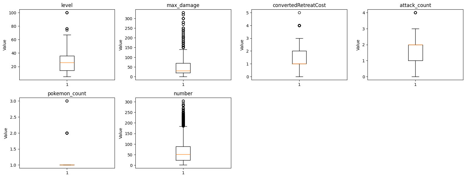
These box plots help us identify outliers and understand the spread of values for each feature. We can see that some features have a few extreme values that might need special attention during modeling. Now lets look at the same features using histograms to see the actual distribution of values.
fig, axes = plt.subplots(4, 4, figsize=(16, 12))
axes = axes.flatten()

for i, feature in enumerate(focus_columns):
    axes[i].hist(data[feature].dropna(), bins=30, edgecolor='black')
    axes[i].set_title(feature)
    axes[i].set_xlabel('Value')
    axes[i].set_ylabel('Frequency')

for j in range(i + 1, len(axes)):
    fig.delaxes(axes[j])

plt.tight_layout()
plt.show()
The histograms show us how the values are distributed. We can see that some features like hp have a more discrete distribution with specific common values, while others like level have a more continuous distribution.
Since hp is our target variable, lets take a closer look at its distribution with a side-by-side comparison.
feature = 'hp'

fig, axes = plt.subplots(1, 2, figsize=(12, 4))

axes[0].boxplot(data[feature].dropna())
axes[0].set_title(f'Box Plot of {feature}')
axes[0].set_ylabel('Value')

axes[1].hist(data[feature].dropna(), bins=30, edgecolor='black')
axes[1].set_title(f'Histogram of {feature}')
axes[1].set_xlabel('Value')
axes[1].set_ylabel('Frequency')

plt.tight_layout()
plt.show()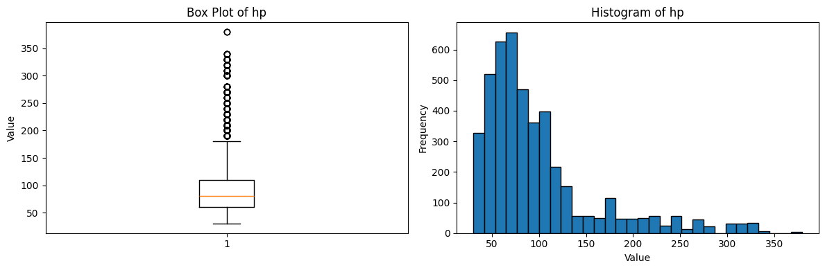
From these plots, we can see that HP values tend to cluster around certain values, which makes sense since Pokemon cards typically have HP values in multiples of 10. This might be something to consider when building our model.
Feature Correlations
Understanding how features relate to each other and to our target variable is crucial. Lets create a correlation heatmap to visualize these relationships.
corr_df = data[numeric_features]

corr_matrix = corr_df.corr()

plt.figure(figsize=(14, 10))

sns.heatmap(
    corr_matrix,
    annot=True,
    fmt=".2f",
    cmap="coolwarm",
    linewidths=0.5
)

plt.title('Correlation Heatmap of Features')
plt.show()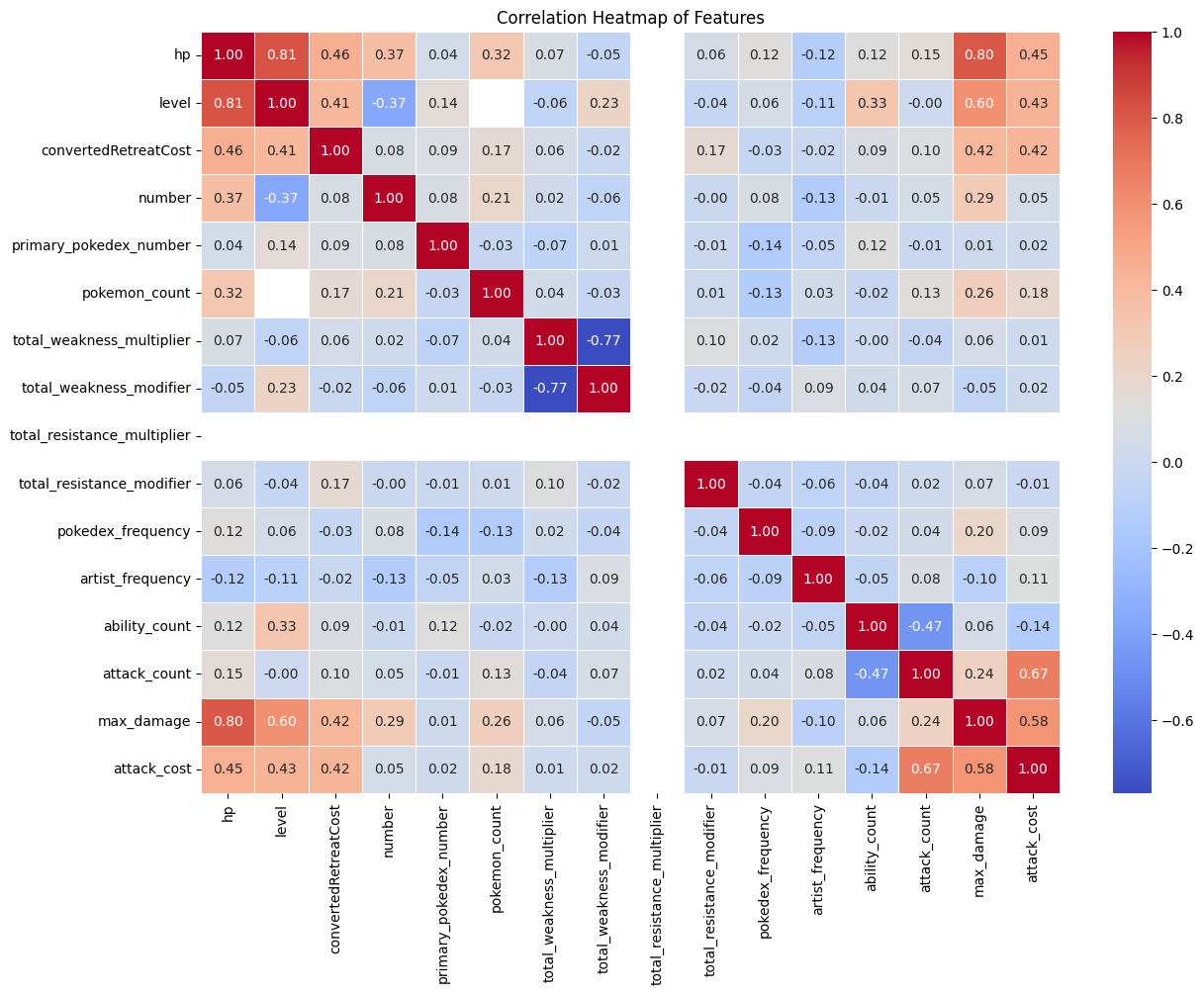
This correlation heatmap shows us several interesting relationships:
- Features that are strongly correlated with
hp(our target) will be important for our model - Features that are highly correlated with each other might cause multicollinearity issues
- We can identify which features might be redundant or provide little unique information
We should pay special attention to features that have strong positive or negative correlations with hp as these will likely be the most predictive.
Categorical Feature Distributions
Now lets look at the distribution of categorical features like types and subtypes. These were one-hot encoded in part 2, so we can count how many cards fall into each category.
type_columns = data.filter(regex='^type_')
type_counts = type_columns.sum()
type_counts = type_counts.sort_values(ascending=False)

plt.figure(figsize=(12, 6))
plt.bar(range(len(type_counts)), type_counts.values)
plt.xticks(range(len(type_counts)), type_counts.index, rotation=45, ha='right')
plt.xlabel('Type')
plt.ylabel('Count')
plt.title('Distribution of Pokemon Card Types')
plt.tight_layout()
plt.show()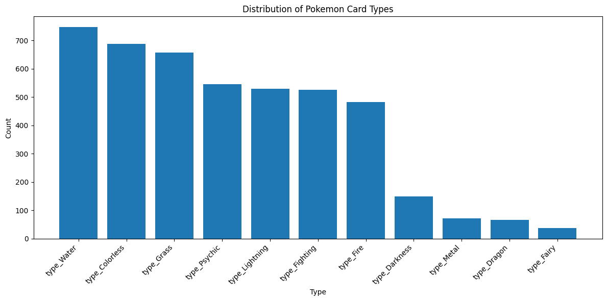
This gives us a sense of how balanced our dataset is across different Pokemon types. If certain types are underrepresented, our model might not perform as well for those types. Lets also look at the distribution of subtypes.
subtype_columns = data.filter(regex='^subtype_')
subtype_counts = subtype_columns.sum()
subtype_counts = subtype_counts.sort_values(ascending=False)

plt.figure(figsize=(12, 6))
plt.bar(range(len(subtype_counts)), subtype_counts.values)
plt.xticks(range(len(subtype_counts)), subtype_counts.index, rotation=45, ha='right')
plt.xlabel('Type')
plt.ylabel('Count')
plt.title('Distribution of Pokemon Card Types')
plt.tight_layout()
plt.show()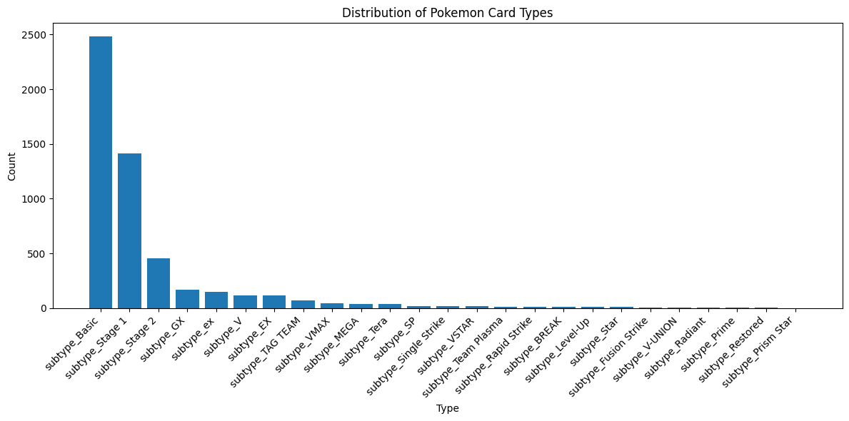
Key Takeaways
From this exploratory data analysis, we’ve learned several important things about our dataset:
- Feature Distributions: Most features have reasonable distributions, though some have outliers we might need to handle
- Target Variable: HP values are discrete and tend to fall into specific ranges
- Correlations: We’ve identified which features are most strongly correlated with HP
- Class Balance: We can see how our data is distributed across different types and subtypes
These insights will help guide our feature selection and modeling decisions in the next part of this project. We now have a solid understanding of what we’re working with and can make informed decisions about how to build our predictive model.